What happens when 80 buggies move but staff is left to guess?
Problem: Manual fragmented communication leaves staff blind to buggy availability and distribution, causing delays, uneven load, and predictable guest wait times.
Design requirement: Design a dashboard where NO GPS is required, no payment & ticketing
Timeline: 6 Days
Vibe Designing Project
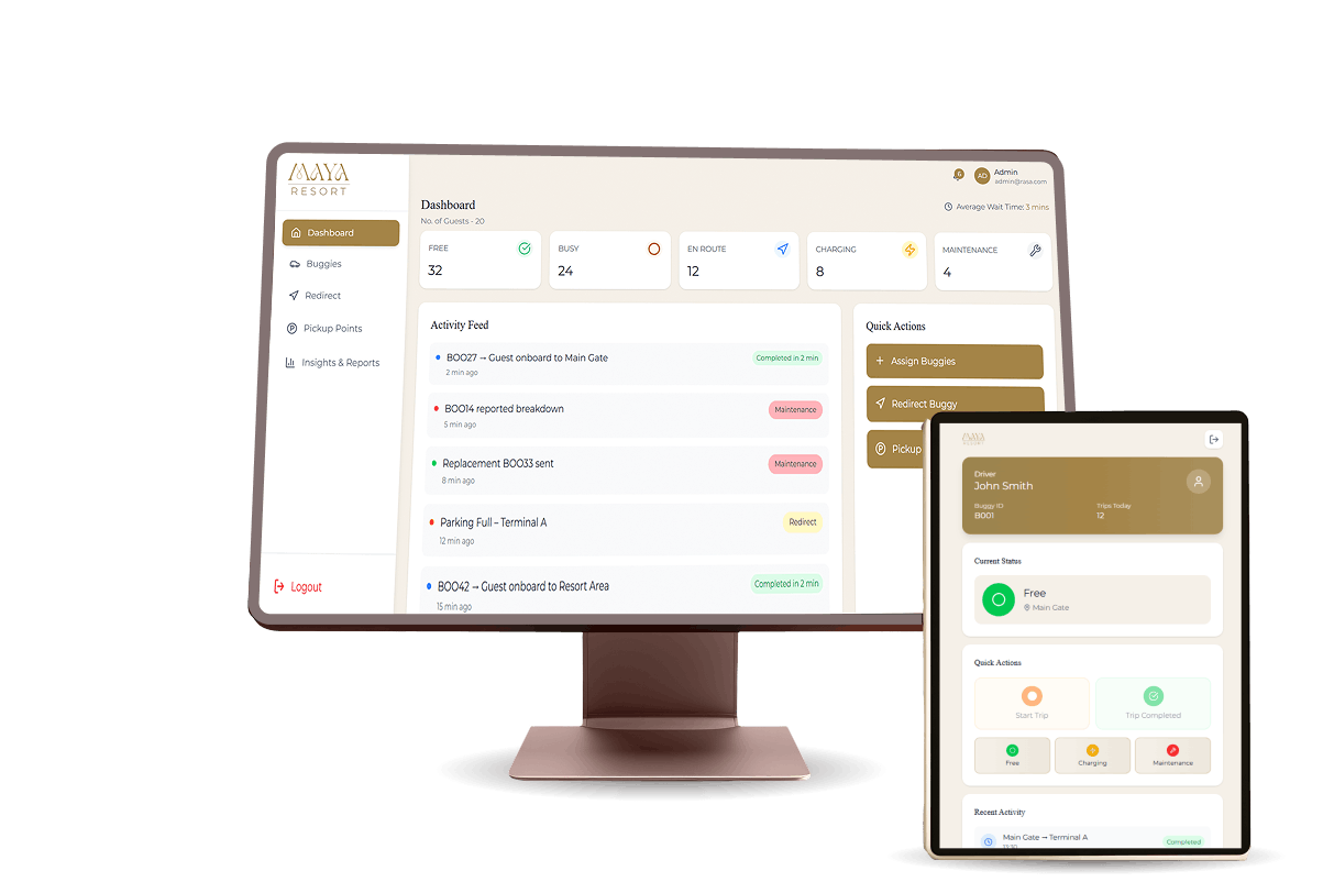
Have a look on solution video
Let's Look at Operational Staff (Raj's) Journey
Its early morning. There's one event at 10.00 am at pool deck. Guest calls at the reception for 2 buggies
Raj logins as operational staff to his dashboard and starts his day. He thinks "let me quickly login". He is preparing for the day and little tense as he wants to avoid making guests wait.
He Clicks on Login by entering email and password
Now he enters the dashboard, he sees the overview and quickly recognises the "assign buggy" in quick action panel. He is Confident because the interface gives him clarity.
"Okay, "This should be quick…Guests shouldn't wait more." Let me assign quickly
Clicks on assign buggies by selecting pickup location, no of guests and buggies which are nearer from pickup point. oh! this was quick.
Meanwhile, The driver (john) gets the notification about the trip/ride
John sees the trip pop up assigned by raj. He notices clarity were exactly he needs to pickup the guests, he is happy that he knows were he needs to go
"Let me accept and move quickly." he thinks.
Clicks on "accept" and starts the trip.
Oh! I dropped guests. now. Let me update before I forget .He clicks on "trip completed". feeling relief quickly.
"where should I park now"? oh! there's parking place in pool deck.
Clicks on "trip completed". he need not be worried about accidently tapping because, it is anyway disabled after clicking on "trip completed"
In pool deck parking, he finds the place to park. now, he thinks let me update before I parked.
Done. I am free now. This was quick and easy.
Clicks on "parked". and selects the location where it is parked i.e- pool deck
Raj's dashboard updated
His dashboard shows the updates in "activity feed" and parking status as "parked" .
Raj and john both feels accomplished
Update happens in activity feed and parking zone after John (driver) completes the trip and parks his buggy.
Why I prioritised and highlighted the "Quick Actions" section upfront
Final Section
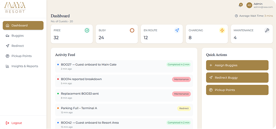
Let us understand the need for prominent actions for driver and staff
Primary Users
- Staff members will have access to see all the details
Secondary Users
- Drivers - provide simple "Started / Reached / Completed" updates
- Parking updates
Guest request for 2 buggies as they want to go to pool from Main
Receptionist immediately assigns the buggy to driver #27 buggy and #28 buggy assigned to john(driver)
Driver clicks on "start journey"
Driver drops the guests to pool and parks at location, and updates as I've parked
Updates are seen on dashboard as, Parking area and activity feed
Key Features
Buggy Status View
Free / Busy / En Route / Charging / Maintenance / Idle time indicators
Pickup Point Distribution
Number of buggies present + guests waiting (optional input)
Quick Assign & Redirect Flow
Assign buggy → confirm → update en route → arrival
Manual Movement Updates
No GPS required; simple status transitions
Load Management Alerts
Shortage, overload, idle too long, charging too long
Basic Insights
Peak hours
Repeat shortage points
Trip patterns
I jotted down what needs to get highlighted on dashboard-
- Assign
- Redirect
- Parking status

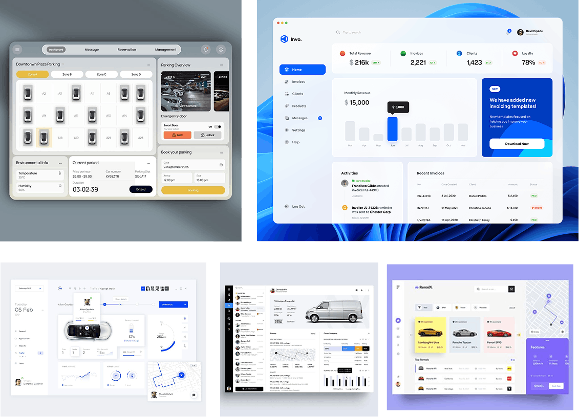
Moodboard
Colors: Maintained luxury Approach towards pastels
Evolution of Dashboard
Laying the Structural Blueprint of the Dashboard
After exploring the problem and features, I started with wireframes to clearly state the main features, alerts, parkings, and different status of the dashboards.
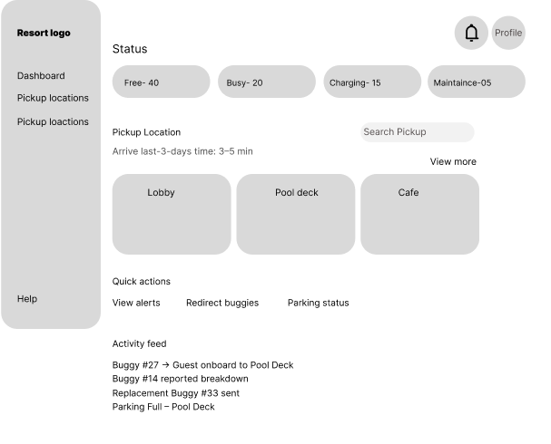
Iteration 1
Prioritizing Key Actions for Operational Efficiency
I added the basic main features at the top to get it highlighted for the operational staff as
- assign
- redirect
- parking zones
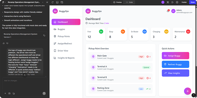
Iteration 2
Enhancing Clarity Through Visual Hierarchy
I Created the colors and branding for clear visibility and to understand the product how it will look
I wanted to give priority to "assign buggies" so, added a floating button
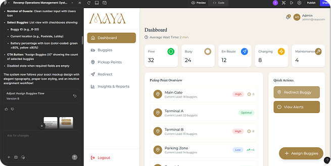
Iteration 3
Final "Quick Actions" Section
Why I Created Driver's Dashboard Sepeartely?
Understanding Driver and Manager Needs
Initially I mapped all user tasks into one interface:
- Driver updates status
- Receptionist assigns buggies
- Manager views availability
- Trips are tracked from the same screen
Problem Observed:
Drivers had to navigate through clutter they didn't need. Their actions were
buried between managerial insights and fleet charts.
Insight
Operational urgency for drivers ≠ Analytical overview for management.
This iteration failed at speed, clarity, and action simplicity.
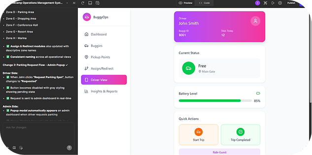
Iteration 1
Testing Conditional Dashboards
Next, I tried conditional UI:
- Same dashboard, different views depending on login
- Drivers saw limited panels
- Managers saw detailed data & fleet controls
Insight:
Just filtering a dashboard isn't enough - drivers need a different mental model, not a reduced one.
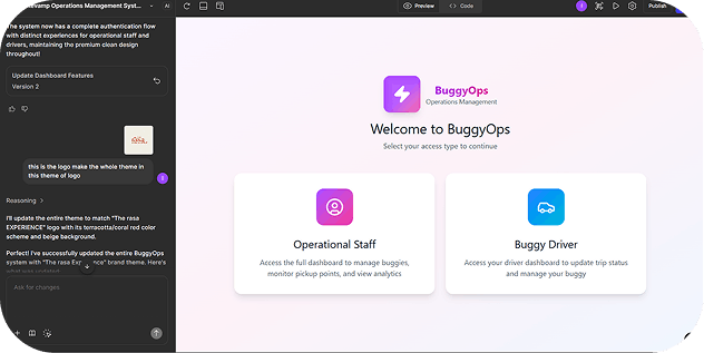
Iteration 2
Separating Driver and Manager Interfaces
Fully Independent Driver Dashboard
This became a turning point.
I realized:
- Drivers don't monitor, they execute
- Drivers don't need data visibility, they input data
- Drivers operate in motion → UI must be action-centric
- Managers need visibility → UI must be information-dense
So, I separated it completely.
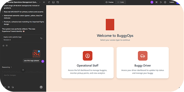
Iteration 3
Final Driver's & Manager's separate Dashboard
Why I Added Different Zones in Pickup Points Section?
Final Section
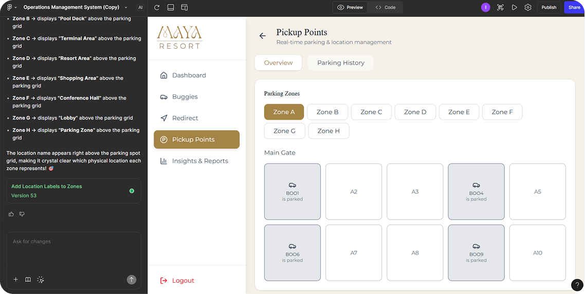
Introduced Zones to Reduce Search Time
Reduce Search Time
Without zones, finding a parked buggy requires scanning the entire grid. Zones create localised clusters, so staff can quickly jump to the right area.
Instead of "Where is B001?"
It becomes "Check Zone A → B001 is parked."
This reduced decision friction & time to retrieve a vehicle.
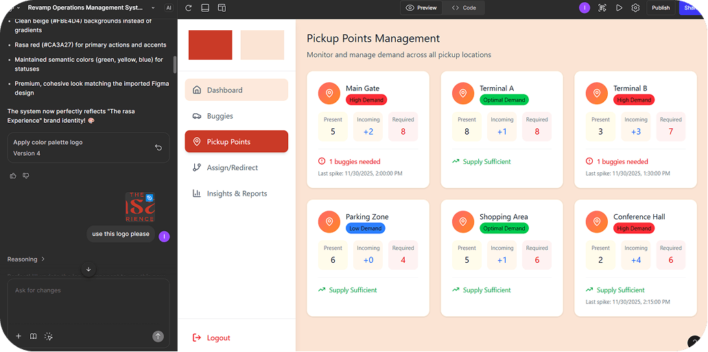
No Clarity of showing the parking buggies
Shifted to Real-World Resort Layout for Better Familiarity
Every resort has physical areas - Lobby, Pool Deck, Parking Zone, Shopping Line, etc.
Reflecting real-world spaces in UI helps users think naturally, not technically.
The system aligns with how staff already navigate in real life.
- Visual familiarity
- Lower learning curves
- Zero mental translation
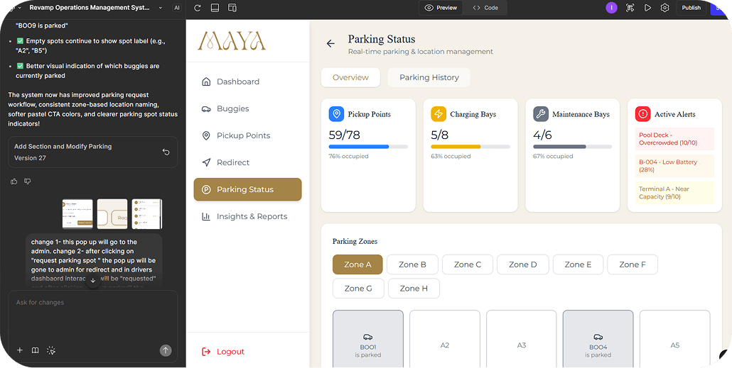
Removed the pickup points, charging bays as it is already showing on dashboard
Final Design

Flows
Redirect flow of staff
Request for parking spot - Driver's flow
Future scope
-
Voice + One-Tap Operations for Drivers
Because they operate while moving, remove more steps:
- Accept request via voice command
- One swipe completion
- Auto-status reset on drop-point confirmation
-
Maintenance & Charging Scheduler
Instead of manual reminders, the dashboard could support:
- Battery-based auto status tracking
- Scheduled maintenance notifications
- Service history logs
-
Automated Dispatch Suggestions
Using zone availability + previous movement frequency, the system can recommend which driver should be assigned next. System assists the staff instead of staff deciding everything.
Reflections
First it is very necessary to understand the problem on your own. It gives clarity to work on. then, I learned how intent-based prompting shaped the problem more clearly, guided the emotional groundwork, and helped build a system where vibe was turned into coded design logic.
Vibe coding transformed feelings into measurable rules - color, motion, microcopy, pace — making interaction emotional, not just visual.
This process changed how I build products: not UI first, but experience-energy first.
Thankyou:))
A heartfelt thank you to my mentor Anudep sir - your support and encouragement truly made a difference in this journey.
Contact me here..